How to analyze top landing pages and exit pages on your website?
Having a website means having landing pages and tracking the traffic and performance of pages can bring great amounts of marketing and business insights.
Let’s see what are landing pages, how to easily analyze them and how to use such analysis as a site owner.
- What is a landing page?
- How do I see the pages with most traffic, time on page, bounce rate, exit rate, etc.?
- How to use this information as a site owner?
What is a landing page?
Literally, a landing page is a page where visitors “land” on your website after clicking a link on social media, ad, referral, etc.
This is a single web page usually designed with a specific intent/message: to tell about a feature, to educate about a topic (like this page), to get a form filled, to sell something, etc.
A good landing page is well researched for the needs of its audience, consistent with the messaging of the content piece that brought the traffic, clear, straightforward. You can build it programmatically or with the help of a content management system.
Once built, the next step is to track how many visitors each page gets, from where, how, and other performance metrics. Since a website can have many landing pages, it becomes even more important to track what’s working with your audience and what’s not.
How do I see the pages with most traffic, time on page, bounce rate, exit rate, etc.?
To analyze the top landing and entry/exit pages on your website, you can use a tool like Plausible Analytics. You can start tracking the performance of landing pages within minutes with Plausible’s standard script itself and no special settings required.
This helps you understand which content or features are drawing in the most traffic, allowing you to gauge interest in specific products, blog posts, pricing pages, or other important sections.
You can also club this information with other analytics like top sources to understand where your traffic is coming from and which channels (e.g., search engines, social media, or referrals) are driving visitors to specific pages.
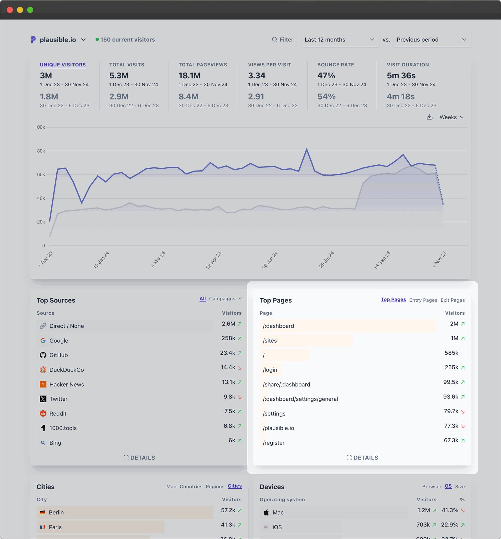
When you open your Plausible dashboard, one of the key reports you’ll see by default is the “Top Pages” report. It shows you at a glance, which of your landing pages received the most visits, where the visitors land on, and where they exit from, for the time period selected.
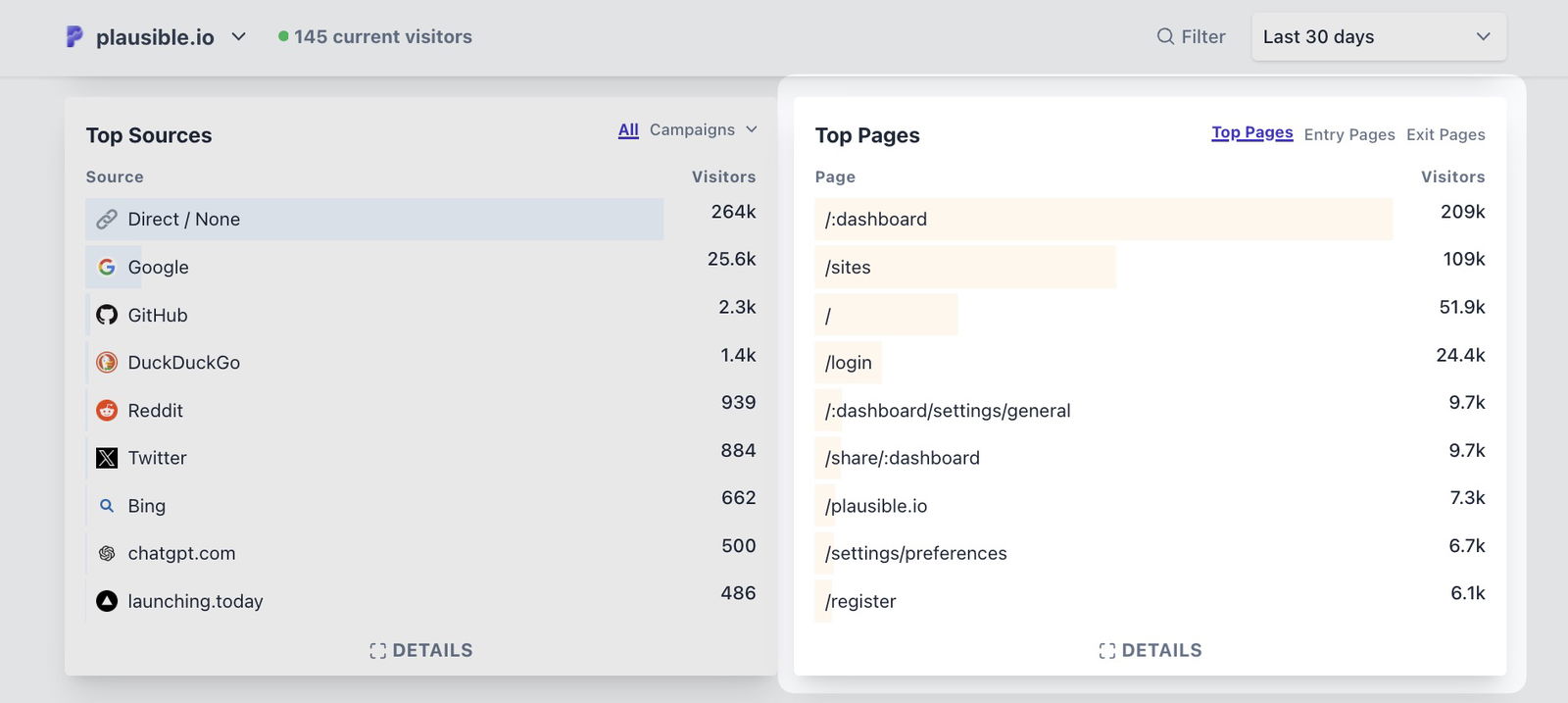
If you don’t have an active Plausible account, you can open our live demo in a new tab to play around with the Pages report and the dashboard. Let’s see how to use the reports:
Top, Entry and Exit pages
The Pages report is not only limited to the Top Pages, but you can switch tabs to access the following three types of reports:
- Top Pages – to analyze the pages with the most visitors.
- Entry Pages – to analyze the pages where visitors first land on your site.
- Exit Pages – to analyze the pages where visitors leave your site.
These reports effectively help you pinpoint which pages are drawing in visitors initially, holding their attention, and acting as exit points.
For eg., If you look at our live demo, the top most entries for all the three reports are the same (“/:dashboard,” “/sites”, etc.), suggesting that maximum Plausible visitors enter, stay and exit from their Plausible accounts itself, indicating maximum engagement with the core product.
It can also be used as an insight, because if we were to announce an urgent product update tomorrow, we know an in-app notification may be the best place to do so.
Secondly, you can click the “Details” link to get the full list of the types of pages in question. The associated metrics differ. You can also sort your reports by clicking on any metric.
For instance, sorting by visitors can help you see which pages attract the most visits, while sorting by time on page shows you where visitors spend the most time.
“Top Pages” displays the Visitors, Pageviews, Bounce Rate, and Time on Page. “Entry Pages” displays the Visitors, Total Entrances, and Visit Duration. “Exit pages” displays the Visitors, Total Exits, and Exit Rate.
P.S. You can check out the definitions of such metrics here.
Filter and segment entries
If you click on any entry in any of the three kinds of reports, the entire dashboard gets filtered by it and displays stats associated with that landing page only.
For eg., Our live demo shows that during the past 30 days, ignoring the first few product-specific pages, our landing page on open-source web analytics brought us 1.5k visitors.
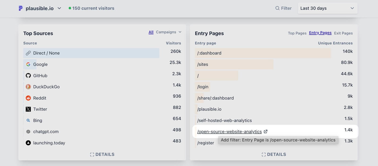
Wanting to learn more about acquiring such visitors, we can simply click on this entry to filter the dashboard. And once we do (check the filtered dashboard here), we see that Google, GitHub and DuckDuckGo mostly got us such visitors.
We can also learn about the locations such visitors were from, the devices they used, which goals they completed, etc. It is possible to dig as further as we want, by adding filters by clicking on more such entries and effectively analyzing audience segments.
Tip: If you’re unsure about the landing page path, click the “open in new tab” icon to quickly view the page.
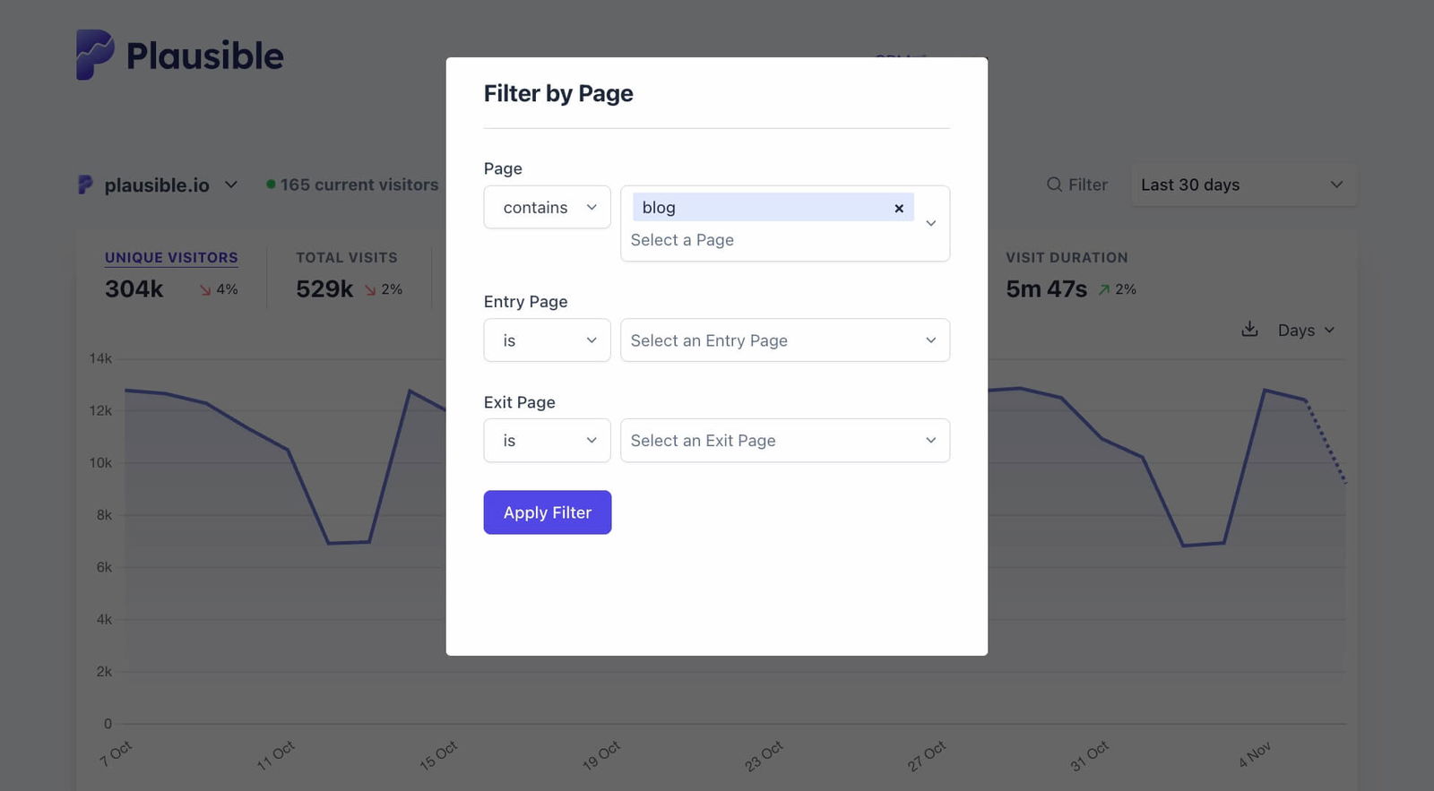
You can also use the “Filter” option to start a fresh workflow. For eg., you can analyze only the landing pages with the URL path containing the word “blog” to analyze the performance of your blog.
Special cases and best practices
While the Pages report is straightforward for most cases, you can see if any of the below cases apply to you and manage them accordingly.
Shield specific traffic from being recorded
You can permanently block traffic from being recorded to specific pages or sections if they aren’t relevant to your analysis (such as a blog preview page) by using the Shields feature.
With the very same feature, you can also allow only specific hostnames to let Plausible track their traffic. This keeps your reports clean and more usable.
Moreover, you can simply filter your dashboard by specific hostnames and see the pages only associated with that. You may be surprised to see the results.
If we filter by Google Translate hostname on our live demo for example, we see completely different results with the Top Pages, sources, cities, everything getting changed.
By the way, we detect and block bot traffic by default so you never have to worry about excluding such traffic.
View combined Pages reports for multiple sites
You may have multiple sites/dashboards in your Plausible account. This could be if you have a Marketing agency, or a collection of tools with separate sites, or may have a different dashboard for multiple subdomains (for eg., “site.com” and “app.site.com”) as a SaaS.
In such cases, you may want aggregated stats from all or some of such sites. You can set this up using roll-up reporting. This way, you can get a birds-eye view of your top performing, and entry and exit pages.
Retain query parameters in a URL
Plausible automatically discards query parameters from URLs to prevent them from showing up as separate pages in the report.
For eg., if someone visits `site.com/index.php?article=some_article&page=11`, it will be recorded as `yoursite.com/index.php`, regardless of the query details. The referrers and UTMs are recorded separately in the Top Sources report though.
If there are specific pages where query parameters are important and should be retained in the report, you can capture the full URL, including the query part.
Shield sensitive information from URLs
In some cases, you might prefer to use a custom URL to replace the actual URL of a page. This is particularly useful for aggregating multiple pages containing user-specific identifiers (e.g., `/profile/12345`), which can impact user privacy and lead to fragmented data in your reports.
By configuring a custom URL in Plausible, you can consolidate data from these pages into a single report entry, maintaining user privacy while simplifying your analytics.
Avoid trailing Slash Discrepancies
Sometimes, you may see identical page paths both with and without a trailing slash (e.g., `/some_article` and `/some_article/`). This discrepancy can create duplicate entries in your Pages report, which may confuse the analysis of traffic to specific pages.
To address this, apply a 301 redirect to standardize URL paths, ensuring all traffic is directed to a single version of each page. This will help you maintain accurate data in the Pages report.
Track Single-Page Applications (SPA) and URL Hashes
Plausible is designed to automatically track page views in single-page applications (SPAs) that use the `pushState` method for routing.
If your site uses a frontend framework that relies on hash-based routing, i.e. URLs ending in `#section` (eg. https://plausible.io/#pricing), you can track these hash-based routes accurately.
This setup enables you to track user navigation within your app without requiring additional configuration, keeping your Pages report comprehensive even in SPA environments.
By understanding and addressing these cases, you can ensure your Pages report remains accurate and reflective of real user behavior on your site. If you need to suggest a new case we should be addressing for accurately tracking landing pages in Plausible, our feedback board is always open.
How to use this information as a site owner?
Let’s see an example first. I noticed that in October 2024, one of the top exit pages for Plausible was our Changelog page. So I applied a filter for the same, denoted by “1” in the screenshot below.
This filtered the dashboard showing that the sessions that saw people exiting through the Changelog page, had 2.4k visitors, 7.6k pageviews, etc.
The next thing I wanted to know was where did such sessions land on? So I switched to the Entry Pages tab, denoted by “2” in the screenshot below.
This clearly showed that, apart from 700 people who directly came to the changelog page and exited from there only (this matches with the bounce rate of 28% too), maximum people were the ones using their dashboards, logging in, etc.
Now that makes sense and is a good sign. We don’t need to guess as to why the Changelog was acting as a top exit page.
So we know that perhaps many subscribers like visiting the changelog before closing their dashboards. Considering that we have ~14k paying subscribers as of November ‘24, 2.4k visitors exhibiting such behavior is a decent chunk of Plausible users and we should optimize the changelog for them.
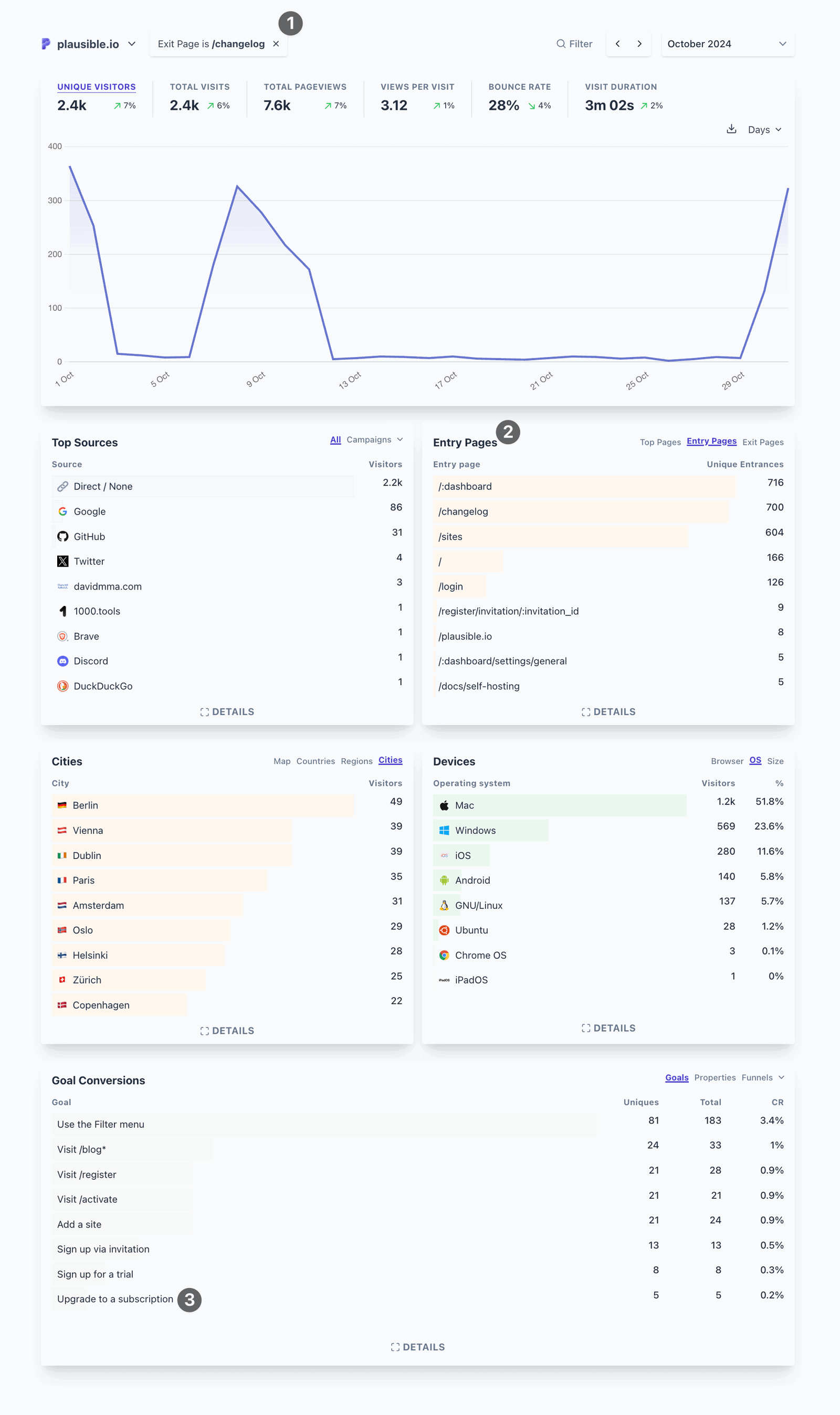
If you look at “3” in the screenshot, we also know that 5 such people upgraded to a paid plan before exiting. Moreover, the other “Goal Conversions” entries are a good indicator of what other events happened in those sessions.
This helps us build a specific visitor flow and make multiple conclusions and build an understanding of what works for Plausible visitors/users and what doesn’t.
Here’s how our subscribers analyze the Pages reports to analyze their website’s performance:
Identify what’s attracting or throwing off visitors
The Entry Pages report shows which pages are the first touchpoints for visitors. If certain blog posts or product pages are consistently the top entry points, it means they’re resonating well in search engines or through social sharing.
Knowing this, you can keep such pages updated and keep them SEO’d. You can also learn about the kinds of topics that resonate with your audience and create marketing strategies accordingly.
For eg., We at Plausible identified that content about using privacy-friendly analytics serves our visitors better than other types of content. So we try to create similar content on related subjects.
Similarly, if your Exit Pages report shows that visitors are mostly exiting from your pricing page, then it may be an indicator that your pricing is not well accepted by your audience yet.
If you can confirm this conclusion through social media, surveys, A/B testing, or any communication channel with your ideal customers, then you’ll have a great insight about adjusting your pricing accordingly.
Other red flags could be having high exit rates on signup page, documentation, etc. since the user intent is generally high on such pages.
Assess the impact of marketing campaigns
If you run marketing campaigns (e.g., paid ads, email campaigns), the Landing Page report can show if these efforts are driving visitors to the intended pages.
To confirm campaign success, check if visitors land on the pages you’re promoting. If a campaign is meant to drive users to a particular offer or landing page, but that page isn’t showing up here, it may need adjustments.
Make use of UTM tracking for accurately attributing marketing channels. You can also visualize visitor journeys by setting up a funnel in Plausible.
Use the insights to align ad messaging with popular pages, or adjust targeting to increase traffic to underperforming landing pages.
Improve UX on entry pages
Since landing pages are the first impression visitors get of your site, it’s good to optimize them for user experience.
So identify traffic patterns. Like, which landing pages have high traffic but lower visit duration than expected for such pages. Once you identify such a page, filter your dashboard by it and see what the bounce rate (the percentage of visitors with a single page view) looks like.
This can clearly signal areas to improve. Some common optimizations include page load speed, layout, content relevance, clear calls-to-action (CTAs) or links to guide visitors to explore other parts of your site, like product pages, contact forms, or resources.
Optimize low-performing pages
If pages important to business, like your pricing or sign-up page, are low on the list, it could be a signal to improve their visibility –– through SEO, internal linking, or UX adjustments.
Spot opportunities for conversion
For SaaS, pages with high traffic but low conversion are prime candidates for putting efforts into conversion optimization. Common optimizations include A/B testing calls-to-action (CTAs), updating content, or improving page load speed.
Do content planning
Use this report to see which types of blog posts or articles resonate most with your audience. Pages that perform well can give way to future content ideas. Those with lower views might benefit from updates or SEO or being deleted for that matter.
How do you like to use your Pages report? Let us know at reading@plausible.io and all the best. 🚀